skip to main |
skip to sidebar
 This past week Nathan Shedroff gave a guest lecture in our UC Davis Design class. Shedroff's main topic was sustainability and the role design plays to the earth present, past, and future. He presented some disturbing insights, elaborating on how design is the culprit in so many things wrong with sustainability and that "there's no such thing as sustainable design." This is what made his presentation so effective; blunt truths which made some designers feel like 'well then what's the point of designing?' and leaving right then. However, after stating some harsh realities, Shedroff goes on with content which explains ways to work around this and do the best we can as designers. For example, design has been the problem with regards to sustainability because poor design creates waste and uselessness. Also "there's no such thing as sustainable design" because 100% sustainability doesn't exist. Fortunately though, well-thought design can help ease both issues. America was much more self-sufficient in decades past (such as the farming lifestyle) and values have changed since then, but Shedroff points out such standards happened in the past and are thus possible. I feel one of the reasons that values have shifted so much is because of marketing influence. It can sway opinions on how people believe beauty is classified, what's popular, and the image one should maintain. Perhaps because of this, too many now largely focus on what's convenient, what they have to do, and what affects them. For example many grocery shoppers don't bring their own reusable totes nor return and recycle their plastic bags. This is because for some it's more convenient to just take the store's plastic bags, there's no laws enforcing otherwise, continuously taking plastic bags doesn't affect them personally, or some just simply aren't aware. Maybe good design could contribute to solving parts of these? It's up to sustainability-contributing designers to answer this.
pic credit: core77
 Many of us tend to become attached to the simpler easier to operate things more so than complex things with thick instruction manuals. Something about being able to use a program or maybe an electronic device first try creates this instant bond of familiarity. With recent social networking websites (Myspace, Facebook, Twitter), similar assumptions can be made. Originally Myspace was the main social network website because Facebook was exclusive to college students, but once that was lifted Facebook rapidly grew in popularity. While Myspace remained a domain for music and celebrities, a mass of average users made the switch to Facebook. A large reason was simply, simplicity. Facebook’s layout doesn’t allow for the additional backgrounds or various layouts that slow down load times. Instead their user profiles are uniformed, clean looking, load quicker, and each profile has the same familiar navigation. Now the latest social network craze is Twitter, and it’s tough to get any less complicated. Twitter concentrates on the niche of what people are doing in between all the emails, IMs, text messages, and other forms of electronic communication. Users post quick short updates about what they’re doing. That’s it. Meat of the service. While simple things can’t cover the same ground as more complicated ones, there’s something to be said for their versatility and instant appeal.
 Our design class was recently given the opportunity to watch Objectified, a film about the design and purpose of objects. One of the most memorable topics in the film talked about how almost everything that fills this world was at one point decided upon and designed. Their example was Post-its, a simple pad of sticky sectioned paper, but even these had to be designed. Someone had to determine size, shape, paper color, paper type, packaging, etc. We really are surrounded by so many objects in our daily lives; it becomes this massive sea of design. From this laptop I'm writing on to the shoes at my feet, stretching out to the clutter of items and furniture in this surrounding room, everything was designed. So what makes for good design versus not so good design? Objectified brings up a couple more points in saying that good design involves the least design, and how people tend to want what's new and now even though it may not last long. Maybe good design is something that is simple and stands the test of time. Are classic things the epitome of design? Also mentioned was the phrase "form follows function" and how such is not necessarily true anymore. In previous years the form of an object often depicted its usefulness, purpose, content, and value among other things. The invention of the microchip changed all this, with electronics such as the Iphone, GPS devices, etc. It's hard to determine at a glance exactly what the function of these objects is. Maybe ambiguity is the key to modern and thus successful design? This is all up for discussion, but I feel that good design fulfills its purpose without excess clutter, and if executed well it'll leave its mark of success.
pic credit: Charles & Hudson
 'Tis the season is almost here, which means the iconic Christmas tree will be making its rounds soon. These pointy and typically cone shaped trees are often the center piece to holiday decorations. When placed in a mall the decorations tend to be similar to the other interior colors or reflecting the mall's trademark color pallet. For public display outside they're often adorned with the brightest of lights as to shine in any weather condition and to be seen from a great distance. The main personal use of a Christmas tree is found at home, where they serve as festive centerpieces to family events. Often times a tree will reflect the family; lots of arts & crafts ornaments made by the children, or sophisticated decorations maybe indicating a more adult tree, or perhaps lots of personal ornaments depicting favorite sports team or dog breed. Then there are people who like a classic, almost 'Gestalt' tree with unifying colors, rounded uniform ornaments hung in close proximity for eye connectivity, and other decorations to make the tree look like one unit. For those who celebrate with a Christmas tree, they're often the piece which ties all the decorations together.pic credit: Eco-Friendly Christmas
 Advertisements are often ignored background elements vying for consumer attention by standing out from their crowd and being effective. One of the more interesting yet breezed-by ad placements is for the backboards of figure skating rinks, and with the upcoming 2010 Winter Olympics, figure skating events are buzzing even higher with anticipation. With the spotlight always on the skater, it's easy to miss the numerous ads that speed by. All the ads tend to blur together in a sea of color and typography that can seem ineffective. However when the athlete slows down or has their picture taken, suddenly a quiet ad can explode with exposure throughout the media. These types of ads are now in the background to images of a World Champion taking a bow on the ice, or falling at a crucial moment, or maybe executing a historic jump for the first time. The backboard ad might not be prominent, but still serves its purpose of exposure. Designing a backboard ad involves knowing the guidelines, and as with any design a successful final product will fulfill the goal without being overbearingly dominant. Images aren't allowed as this distracts from the athlete and typically a backboard ad is created from a few spot colors and depicts the advertiser's logo or an icon. Even though they may seem simple, these ads blend well with the surroundings of their placement spots.
pic credit: Video Replay=Artistry?
 Color is all around; used to express mood, feelings, category, expression, and much more. We look around and are bombarded by it. Everyone has a favorite color. Perhaps chosen because it makes them the happiest, or maybe because they feel it represents their personality. That's the thing about color; it represents so many facets. Blue for boys, and pink for darling girls. Red means loves and yellow for friendship. Why is this? It has something to do with color theory, or the guiding principles to how we feel about and see color. The often used artist primary colors (red, yellow, blue) lead to secondary and then tertiary colors. Same goes for onscreen primary colors (red, green, blue) and the printing primary subtractive colors (cyan, magenta, yellow). From these come rainbows of colors. Warm colors tend to be the reds to yellow, and cool are greens to violets. Most of this is psychological, with one possible explanation being yellow and orange are associated with a warm sun, while blue green can be linked to a cool river. While plain sense tells us color is just color, as emotional humans it's hard not to associate certain colors with experiences. Red and green Christmas; red, white, and blue American; pink and red Valentine's. Sometimes even the lack of color can become telling. Black and white photography attempts to eliminate emotion of color and focus on shadows and value. Color expresses so much in this society of emotions and association; it can both lift us up or bring down a mood.
pic credit: Photo Articles
 The other day while channel surfing, I landed on a shopping network and couldn't help but take note of the product packaging designs. The items for sale were shower gels and shampoos of the sort but the way they were described sounded delicious and mouth-watering. Even the bubble bath was bottled in a soda pop style container. From oatmeal cookies, to watermelon, to eggnog and hot cocoa, every description made me hungry for the real thing. Products like these are cleverly designed to not just serve their functional purpose, but also to appeal to other senses. These products are largely sold on nostalgic scents, bright eye-catching colors, and well-written words on the bottle. All part of good marketing designs. As with many products and goosd today, if they were to be sold on just the bare essentials themselves, store shelves would look much plainer. Many items are purchased based on someone's favorite color, what kind of mood the product gives off, or how attractive the container is. All the extras and accentuates and packaging are what make the complete product design. It's important to take note of some of the 'gimmicks' and put them into perspective, but at the same time give credit to well-thought out designs.
pic credit: Good Housekeeping
 One of the most exciting moments ever in a class (I feel like that's saying a lot) came last week when our Design class was graced with the presence of Christine Gambito of the online sensation Happy Slip. I'd never heard of her productions before last week yet she still felt like a celebrity after just watching one video. Her videos are relatable and funny and have a special quirkiness to them; almost as if because she is a one-man team they feel like anyone can be inspired and creative and make their own videos as well. Gambito herself has this vibe about her that feels unrefined, is very telling through her facial expressions, and someone who is comfortable with herself. This shines through in her videos as she's not afraid to dress up and act out different and personal roles. Then there are the accompanying things such as her familiar 'Happy Slip' logo and the colorful and easily navigated layout of her website. All of these features come together to create the Christine Gambito personal brand; what people see and feel when they think of her. One of the most important elements to a successful career is branding yourself and creating this mental personal profile that is reflected from you and your work. A personal brand allows people to have an idea about who you are and what you can do. It's a professional (and often times personal) tool that portrays you and keeps people interested. With that, time to watch more Happy Slip...
pic credit: Happy Slip website
Currently featured in the Nelson Art Gallery on the UC Davis campus is a collection of beautiful, detailed, and telling quilts...
 This piece is entitled 'Crazy Pockets' from 2008. In these modern quilting times it's becoming less common and not as necessary to make quilts completely from scrap textile pieces, which makes the ones that are a slightly rarer treat. 'Crazy Pockets' was created from old Levi's blue jeans, corduroy pants, and cotton for batting. It was hand quilted (another less common practice nowadays) by Mensie Pettway from Gee's Bend Alabama. What's comforting about this quilt is the familiarity, as many can relate to the materials, and the pockets add an extra dimension of interest and variance. The quilt's pattern comes from the un-dyed fabrics which create a natural value difference, and the rhythm also comes from these variances. It feels like a dark and light contrasting beat, altered and flowing with the movement from the changing stripe directions.
 The piece here is called 'Slave's Popcorn Quilt' and is from the late 19th century. It was crafted by the great grandmother of Avis Collins in Wakefield Virginia. Based on the time period this quilt was created, it was most likely made from material scraps as not to be wasteful. Every little textile scrap was precious and saved to be used for another piece. While the ground of the 'popcorn' pieces is a lavender color, the figure (in the ground/figure relationship) ones are a variety of colors but still within a range. Many of the different colored and patterned pieces are used again and again throughout the quilt. This creates the rhythm. The Gestalt principles lead our eyes to see the solid lavender color as one, and then the varying yet unified squares in between add controlled variance which repeats in the rest of the squares.No 2 quilts are exactly alike, and they are amazing works of art that convey technique, history, rhythm, and pride.
 Oh Halloween, we meet again. Every year some of the best costume designs come from the latest trends. Being the first one to have an idea makes the costume more unique and exciting. Sure witches, green monsters, and over sized character representations are tried and true, but some of the most memorable designs come from what's funny and now. Costumes each year can depict a slice of what's-going-on in present society. For example, on Thursday night the Halloween episode of The Office had characters dressing up at Octomom, Sarah Palin, and Facebook. Other popular costumes elsewhere include "balloon boy," Kate Gosslin, and interrupting Kanye West. Important elements to the designs are making sure it's recognizable and details definitely help. Similar to any design matter, the designer's "scientific method" can be applied for a truly exciting and unique costume.
1. Field research - Investigate what's out there; trends, jokes, news stories.
2. Understand the problem - What kind of overall costume do you want? Flashy or more simple?
3. Ideas - Design, accessories, weather, durability, all kinds of factors to take into account.
4. Prototype - If you have time to trial and error, it will help with the final result.
5. Feedback - Costumes are for showing off to others. See what they think.
6. Repeat - As with anything, the more times tried the more chances to get it right.
Design is everywhere; it's part of society, current trends, and even our costumes.
pic credit: pb pulse
Recently on the UC Davis campus, Professor Geoffrey Chase from San Diego State University came and gave a lecture about sustainability through school curriculum. He brought up the inevitable questions of how companies handle their waste including toxins, water runoffs, and other materials. Next he mentioned that there are 3 domains of sustainability: economic, social, and environmental. After the sustainability big picture overview, Professor Chase went on to say how students have such a key part in changing the future, and not continuing routines as they have been for so long. Our current trends and habits are what caused current situations and we can't expect things to get better without change. One example he pointed to was Hurricane Katrina, which was a disaster never expected.
"Don't eat your seed corn." (This is not sustainable) - Geoffrey Chase
"...education about the environment must be integral." - Tony Cortese
"Teaching students today is like teaching them to live on a planet we have never seen." - Mary Catherine Bateson
How can sustainability become integrated into classes? The Association for the Advancement of Sustainability in Higher Education (AASHE) has a goal of 10% of every American college students' curriculum be regarding the environment. A couple challenges they face are fiscal, needing multiple curricula, people not wanting to get involved in something that doesn't bring professional rewards, and unsure outcomes. Some solutions to these issues have been creating the environmental classes as GE, providing a new major, sustainability programs, and even a graduate school on the subject.
As a student, I feel my school has become more aware about sustainability and the education surrounding it has been showing up more and more in the form of class projects, guest lectures, and just general awareness. There remains plenty of growth that could happen (programs, more clubs, enthusiasm amongst all); it would be amazing to have environmental issues become a solid part of the curriculum. Professor Chase concludes his lecture explaining that sustainability is a responsibility and not just a program, and how many students already have a deep knowledge of what needs to happen.
 Without even realizing it, our minds are trained in psychological tendencies. An example of this is the Gestalt principle, the psychology of our minds seeing unity. Visually the principles might be obvious, but defining and recognizing them took a work of brilliance. An element which stands out is the focal point and high on the visual hierarchy. This can be attributed to emphasis by isolation, placement, or contrast. Other Gestalt principles include repetition, proximity, and continuation to name a few. All of these are important in 2D and 3D designs because they create eye pleasing coherence. In 2D format this can be in the form of, for example, a website of consistent colors or a smooth connected banner and sidebar for the illusion of connectivity. Another could be a poster ad with the product being advertised isolated from the other products. Or a book cover with the protagonist clearly emphasized. 3D designs also utilize these principles. A dress with varying yet similar color values can be interesting and aesthetically pleasing. Or a building (pictured) with similar windows and uniformed gaps create continuation. The Gestalt theories assist designers as a tool for highlighting components in a way that's subtle and eye pleasing, yet effective.
 Ever since the new IKEA font was announced this past summer, many in the design community have voiced their disapproval. The company's switch from Futura to Verdana (the same font you're reading now) was seen as an unnecessary marketing decision. Designers see Verdana as a body font meant for onscreen rather than a headline for-print material font. The characteristics of Verdana which justify this are its legibility, spacing, and obvious stylistic variations. While these are great legibility attributes, it makes for somewhat dull header font. IKEA has joined the crowd of companies who've recently changed their look. Burger King, Jack in the Box, and Tropicana to name a few have also changed their packaged familiarity. These design redesigns are for various reasons, mostly to keep up with changing times and for a fresh look. The risks this always brings is altering a look customers have grown comfortable and familiar with, as many tend to not like change. Another is recognization and making sure they know it's the same company and product, just a new look. Then there's the time and money invested into the change. A lot is at stake with redesign and consumers either like it, are turned off, or somewhere in the middle. As for IKEA, generally from the minds of the average furniture shopper they'll simply say "Who cares?". To view the 2010 issue be sure to check your local mailboxes.
pic credit: Shelter Pop
 Sitting in textile history the other day learning about feather art, made me stop and think about how fortunate and material abundant we are. The Aztecs made beautiful feathered clothing from native bird feathers dyed with charred nuts and mud. They were limited to regional birds and dependent on corded techniques to construct their clothing and shelter. Today, it's amazing how much we have. Even just walking into a Michael's and picking up a couple dollar bag of feathers, dyed in an array of colors. Even plastic or synthetic feathers, just so many ways to get them. Package delivery allows for all kinds of global bird feathers; quails, peacocks, spotted, striped, all kinds of qualities. We're no longer restricted by local breeds' availability, or color, or quantity. The internet and catalogs, combined with the mail system and global trade agreements give people all over the world access to authentic and traditional bird feathers of all kinds. Science and dyes produce synthetic feathers for even greater variety. With access to such assortment, we're given the opportunity to observe and learn and become inspired by this natural art piece. We can visually appreciate the lasting iridescent nature of some feathers, and how some have traits on only one side. In today's society there are so many resources available to us; I'm very much in awe.pic credit: smart code
One of the major differences between art and design is that art is more personal whereas design is meant to be collaborative. A designer cannot keep their designs all to themselves, this defeats the purpose. Designs are created to communicate and express to others. It develops function, purpose, and a goal. There are various steps in the process depending on the goal. This can include decisions on content, form, genre, structure, and quality. While final designs can't please everyone, they should appeal to more than designer only. With this said, it is important for designers to find inspiration outside of themselves. This can mean breaking out of their usual patterns, experiencing new phenomenons, and gaining different perspectives to influence a more versatile designer. Without inspiration from others, their work can become based only on what they know and largely self-satisfying. Various clients calls for the need of various viewpoints. While designers do have their personal brand/identity/style, having a wide range of looks and feels allows them to attract and appeal to diverse clients. Another important reason for becoming influenced by others has to do with history. Many Greats come from the past (Charles & Ray Eames, Jackson Pollock, Charles Sanders Peirce, etc.). Their ideas and knowledge inspire designs today and laid the foundation for what designers know today.
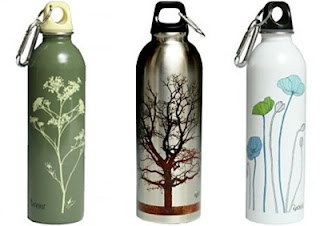 Danger! Danger! World polluted in plastic water bottles! We've heard the insane number of bottles floating the earth, seen the demonstrations of how bottles multiply with just a few peoples' thirst, and learned most typical plastic bottles aren't fully recyclable. Prevention has been stirring for years with Alhambra at-home water delivery, Brita filters, and reusable sports bottles. Now the latest bottles-galore prevention is GREEN water bottles. Many of these are 100% recyclable and BPA-free meaning they leak no toxic chemicals. They've been around for years but recently picked up steam because of current trends. Going green is more popular than ever, combined with continuous redesigns these green bottles have been showing up in more and more places. They feature sleek clean shapes, twist caps, and usually a mountain climbing clip. While functional, these features are also smart design to give the overall bottle an earthy, organic, clean and simple aesthetic. Illustrations on the bottle are typically in similar fashion and complete the look with something nature-inspired or gentle and calming. Earlier bottles tended to be plain and a single solid color, but recent trends has lead to more colorful bottles with various designs to target various ages and genders.
pic credit: Green Beauty & Style Slices
No matter how many times someone asks, or how many times another explains, the answer to 'what is design' is never a concrete definition. When used as a verb the dictionary calls it 'planning' or 'marking' or 'with a definite purpose'. As a noun it can be a 'composition', 'work of art', or an 'intention'. These broad lists go on and on with the point that 'design' has many dictionary definitions, but what is design? Well, it's a major at UC Davis featuring smaller "boutique" sized studio classes of fewer than 30 students. It has 3 main divisions of visual communication, fashion, and interior design. Since a college major tends to define the student, if asked what design is students often give a variety of well-thought out answers, each expressed with a hint of pride and enthusiasm. Several answers might explain that design is art with guidelines, created with a plan and for a purpose. Others will say design is to help people, to communicate visually, and to approach a common goal. To a professional...
Design is a plan for arranging elements in such a way as best to accomplish a particular purpose. — Charles Eames
Design is where science and art break even. — Robin Mathew
Design should never say, “Look at me.” It should always say, “Look at this.” — David Craib
Seriously though, what is design? Design has so many pieces to the definition maybe this is why it has a hard time being defined. Maybe ambiguity is design, and all the definitions come together to create one amazing meaning...design.
 The Nelson Art Gallery, located on the UC Davis campus, is currently featuring Merch Art. This exhibit is the collection of San Francisco inhabitants Lawrence Banka and Judith Gordun, who began with the idea of collecting art geared towards the average middle-class citizen. Artwork purchasing, on a budget! Much of the pieces consists of artist made gifts, which help keep costs reasonable. After all, people don't typically gift their friend a $30k painting. The neat thing about this exhibit is the variety of pieces, many of which are recognizable items with a fascinating twist, yet remain relatable. Meaning it's not a gallery of all statues, or paintings, or ancient findings from long ago. Instead, it's a gathering of seemingly everyday tote bags, children's toys, puzzles, a stuffed animal, even a Rubix cube. Each with the added touch of creative artwork or abnormal composition from various artists. One item was a colorful salt & pepper shaker labeled "salz" and "pfeffer". Another a red pan scraper. The pieces give the impression of something the average person can own, the budget-conscouis art enthusiast can afford, and the everyday person can admire.
pic credit: Stylehive
 This past week Nathan Shedroff gave a guest lecture in our UC Davis Design class. Shedroff's main topic was sustainability and the role design plays to the earth present, past, and future. He presented some disturbing insights, elaborating on how design is the culprit in so many things wrong with sustainability and that "there's no such thing as sustainable design." This is what made his presentation so effective; blunt truths which made some designers feel like 'well then what's the point of designing?' and leaving right then. However, after stating some harsh realities, Shedroff goes on with content which explains ways to work around this and do the best we can as designers. For example, design has been the problem with regards to sustainability because poor design creates waste and uselessness. Also "there's no such thing as sustainable design" because 100% sustainability doesn't exist. Fortunately though, well-thought design can help ease both issues. America was much more self-sufficient in decades past (such as the farming lifestyle) and values have changed since then, but Shedroff points out such standards happened in the past and are thus possible. I feel one of the reasons that values have shifted so much is because of marketing influence. It can sway opinions on how people believe beauty is classified, what's popular, and the image one should maintain. Perhaps because of this, too many now largely focus on what's convenient, what they have to do, and what affects them. For example many grocery shoppers don't bring their own reusable totes nor return and recycle their plastic bags. This is because for some it's more convenient to just take the store's plastic bags, there's no laws enforcing otherwise, continuously taking plastic bags doesn't affect them personally, or some just simply aren't aware. Maybe good design could contribute to solving parts of these? It's up to sustainability-contributing designers to answer this.


