skip to main |
skip to sidebar
 Oh Halloween, we meet again. Every year some of the best costume designs come from the latest trends. Being the first one to have an idea makes the costume more unique and exciting. Sure witches, green monsters, and over sized character representations are tried and true, but some of the most memorable designs come from what's funny and now. Costumes each year can depict a slice of what's-going-on in present society. For example, on Thursday night the Halloween episode of The Office had characters dressing up at Octomom, Sarah Palin, and Facebook. Other popular costumes elsewhere include "balloon boy," Kate Gosslin, and interrupting Kanye West. Important elements to the designs are making sure it's recognizable and details definitely help. Similar to any design matter, the designer's "scientific method" can be applied for a truly exciting and unique costume.
1. Field research - Investigate what's out there; trends, jokes, news stories.
2. Understand the problem - What kind of overall costume do you want? Flashy or more simple?
3. Ideas - Design, accessories, weather, durability, all kinds of factors to take into account.
4. Prototype - If you have time to trial and error, it will help with the final result.
5. Feedback - Costumes are for showing off to others. See what they think.
6. Repeat - As with anything, the more times tried the more chances to get it right.
Design is everywhere; it's part of society, current trends, and even our costumes.
pic credit: pb pulse
Recently on the UC Davis campus, Professor Geoffrey Chase from San Diego State University came and gave a lecture about sustainability through school curriculum. He brought up the inevitable questions of how companies handle their waste including toxins, water runoffs, and other materials. Next he mentioned that there are 3 domains of sustainability: economic, social, and environmental. After the sustainability big picture overview, Professor Chase went on to say how students have such a key part in changing the future, and not continuing routines as they have been for so long. Our current trends and habits are what caused current situations and we can't expect things to get better without change. One example he pointed to was Hurricane Katrina, which was a disaster never expected.
"Don't eat your seed corn." (This is not sustainable) - Geoffrey Chase
"...education about the environment must be integral." - Tony Cortese
"Teaching students today is like teaching them to live on a planet we have never seen." - Mary Catherine Bateson
How can sustainability become integrated into classes? The Association for the Advancement of Sustainability in Higher Education (AASHE) has a goal of 10% of every American college students' curriculum be regarding the environment. A couple challenges they face are fiscal, needing multiple curricula, people not wanting to get involved in something that doesn't bring professional rewards, and unsure outcomes. Some solutions to these issues have been creating the environmental classes as GE, providing a new major, sustainability programs, and even a graduate school on the subject.
As a student, I feel my school has become more aware about sustainability and the education surrounding it has been showing up more and more in the form of class projects, guest lectures, and just general awareness. There remains plenty of growth that could happen (programs, more clubs, enthusiasm amongst all); it would be amazing to have environmental issues become a solid part of the curriculum. Professor Chase concludes his lecture explaining that sustainability is a responsibility and not just a program, and how many students already have a deep knowledge of what needs to happen.
 Without even realizing it, our minds are trained in psychological tendencies. An example of this is the Gestalt principle, the psychology of our minds seeing unity. Visually the principles might be obvious, but defining and recognizing them took a work of brilliance. An element which stands out is the focal point and high on the visual hierarchy. This can be attributed to emphasis by isolation, placement, or contrast. Other Gestalt principles include repetition, proximity, and continuation to name a few. All of these are important in 2D and 3D designs because they create eye pleasing coherence. In 2D format this can be in the form of, for example, a website of consistent colors or a smooth connected banner and sidebar for the illusion of connectivity. Another could be a poster ad with the product being advertised isolated from the other products. Or a book cover with the protagonist clearly emphasized. 3D designs also utilize these principles. A dress with varying yet similar color values can be interesting and aesthetically pleasing. Or a building (pictured) with similar windows and uniformed gaps create continuation. The Gestalt theories assist designers as a tool for highlighting components in a way that's subtle and eye pleasing, yet effective.
 Ever since the new IKEA font was announced this past summer, many in the design community have voiced their disapproval. The company's switch from Futura to Verdana (the same font you're reading now) was seen as an unnecessary marketing decision. Designers see Verdana as a body font meant for onscreen rather than a headline for-print material font. The characteristics of Verdana which justify this are its legibility, spacing, and obvious stylistic variations. While these are great legibility attributes, it makes for somewhat dull header font. IKEA has joined the crowd of companies who've recently changed their look. Burger King, Jack in the Box, and Tropicana to name a few have also changed their packaged familiarity. These design redesigns are for various reasons, mostly to keep up with changing times and for a fresh look. The risks this always brings is altering a look customers have grown comfortable and familiar with, as many tend to not like change. Another is recognization and making sure they know it's the same company and product, just a new look. Then there's the time and money invested into the change. A lot is at stake with redesign and consumers either like it, are turned off, or somewhere in the middle. As for IKEA, generally from the minds of the average furniture shopper they'll simply say "Who cares?". To view the 2010 issue be sure to check your local mailboxes.
pic credit: Shelter Pop
 Sitting in textile history the other day learning about feather art, made me stop and think about how fortunate and material abundant we are. The Aztecs made beautiful feathered clothing from native bird feathers dyed with charred nuts and mud. They were limited to regional birds and dependent on corded techniques to construct their clothing and shelter. Today, it's amazing how much we have. Even just walking into a Michael's and picking up a couple dollar bag of feathers, dyed in an array of colors. Even plastic or synthetic feathers, just so many ways to get them. Package delivery allows for all kinds of global bird feathers; quails, peacocks, spotted, striped, all kinds of qualities. We're no longer restricted by local breeds' availability, or color, or quantity. The internet and catalogs, combined with the mail system and global trade agreements give people all over the world access to authentic and traditional bird feathers of all kinds. Science and dyes produce synthetic feathers for even greater variety. With access to such assortment, we're given the opportunity to observe and learn and become inspired by this natural art piece. We can visually appreciate the lasting iridescent nature of some feathers, and how some have traits on only one side. In today's society there are so many resources available to us; I'm very much in awe.pic credit: smart code
One of the major differences between art and design is that art is more personal whereas design is meant to be collaborative. A designer cannot keep their designs all to themselves, this defeats the purpose. Designs are created to communicate and express to others. It develops function, purpose, and a goal. There are various steps in the process depending on the goal. This can include decisions on content, form, genre, structure, and quality. While final designs can't please everyone, they should appeal to more than designer only. With this said, it is important for designers to find inspiration outside of themselves. This can mean breaking out of their usual patterns, experiencing new phenomenons, and gaining different perspectives to influence a more versatile designer. Without inspiration from others, their work can become based only on what they know and largely self-satisfying. Various clients calls for the need of various viewpoints. While designers do have their personal brand/identity/style, having a wide range of looks and feels allows them to attract and appeal to diverse clients. Another important reason for becoming influenced by others has to do with history. Many Greats come from the past (Charles & Ray Eames, Jackson Pollock, Charles Sanders Peirce, etc.). Their ideas and knowledge inspire designs today and laid the foundation for what designers know today.
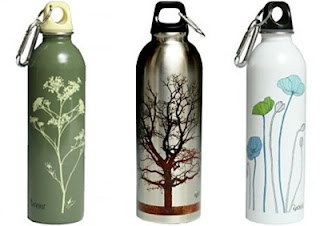 Danger! Danger! World polluted in plastic water bottles! We've heard the insane number of bottles floating the earth, seen the demonstrations of how bottles multiply with just a few peoples' thirst, and learned most typical plastic bottles aren't fully recyclable. Prevention has been stirring for years with Alhambra at-home water delivery, Brita filters, and reusable sports bottles. Now the latest bottles-galore prevention is GREEN water bottles. Many of these are 100% recyclable and BPA-free meaning they leak no toxic chemicals. They've been around for years but recently picked up steam because of current trends. Going green is more popular than ever, combined with continuous redesigns these green bottles have been showing up in more and more places. They feature sleek clean shapes, twist caps, and usually a mountain climbing clip. While functional, these features are also smart design to give the overall bottle an earthy, organic, clean and simple aesthetic. Illustrations on the bottle are typically in similar fashion and complete the look with something nature-inspired or gentle and calming. Earlier bottles tended to be plain and a single solid color, but recent trends has lead to more colorful bottles with various designs to target various ages and genders.
pic credit: Green Beauty & Style Slices
No matter how many times someone asks, or how many times another explains, the answer to 'what is design' is never a concrete definition. When used as a verb the dictionary calls it 'planning' or 'marking' or 'with a definite purpose'. As a noun it can be a 'composition', 'work of art', or an 'intention'. These broad lists go on and on with the point that 'design' has many dictionary definitions, but what is design? Well, it's a major at UC Davis featuring smaller "boutique" sized studio classes of fewer than 30 students. It has 3 main divisions of visual communication, fashion, and interior design. Since a college major tends to define the student, if asked what design is students often give a variety of well-thought out answers, each expressed with a hint of pride and enthusiasm. Several answers might explain that design is art with guidelines, created with a plan and for a purpose. Others will say design is to help people, to communicate visually, and to approach a common goal. To a professional...
Design is a plan for arranging elements in such a way as best to accomplish a particular purpose. — Charles Eames
Design is where science and art break even. — Robin Mathew
Design should never say, “Look at me.” It should always say, “Look at this.” — David Craib
Seriously though, what is design? Design has so many pieces to the definition maybe this is why it has a hard time being defined. Maybe ambiguity is design, and all the definitions come together to create one amazing meaning...design.
 The Nelson Art Gallery, located on the UC Davis campus, is currently featuring Merch Art. This exhibit is the collection of San Francisco inhabitants Lawrence Banka and Judith Gordun, who began with the idea of collecting art geared towards the average middle-class citizen. Artwork purchasing, on a budget! Much of the pieces consists of artist made gifts, which help keep costs reasonable. After all, people don't typically gift their friend a $30k painting. The neat thing about this exhibit is the variety of pieces, many of which are recognizable items with a fascinating twist, yet remain relatable. Meaning it's not a gallery of all statues, or paintings, or ancient findings from long ago. Instead, it's a gathering of seemingly everyday tote bags, children's toys, puzzles, a stuffed animal, even a Rubix cube. Each with the added touch of creative artwork or abnormal composition from various artists. One item was a colorful salt & pepper shaker labeled "salz" and "pfeffer". Another a red pan scraper. The pieces give the impression of something the average person can own, the budget-conscouis art enthusiast can afford, and the everyday person can admire.
pic credit: Stylehive
 Oh Halloween, we meet again. Every year some of the best costume designs come from the latest trends. Being the first one to have an idea makes the costume more unique and exciting. Sure witches, green monsters, and over sized character representations are tried and true, but some of the most memorable designs come from what's funny and now. Costumes each year can depict a slice of what's-going-on in present society. For example, on Thursday night the Halloween episode of The Office had characters dressing up at Octomom, Sarah Palin, and Facebook. Other popular costumes elsewhere include "balloon boy," Kate Gosslin, and interrupting Kanye West. Important elements to the designs are making sure it's recognizable and details definitely help. Similar to any design matter, the designer's "scientific method" can be applied for a truly exciting and unique costume.


